I've been working on a little project relating to the impact of COVID on pediatric preventive care (a weird silver lining to the pandemic) and I realized I was holding some data in my hand that some on SOAPM have been interested in lately. So I'm sharing it.
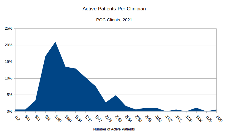
Here's a distribution graph of the patient panel sizes for a big chunk of PCC's practices. I've removed brand new practices, retiring practices, direct care practices, etc., whose body counts are atypical. Here's what we get:
[You can click on the picture to zoom in.]
The X-axis represents the number of patients in a given practice and the Y-axis is the %age of PCC clients in that bucket. In other words, about 21% of PCC clients have around 1200 (1195) patients. 75% of PCC's clients have between 1000 and 1800 patients, with the biggest chunk (65%) in the 1000-1500 range.
What's interesting is that there is some negative correlation between practice size and panel size - in other words, a lot of our smaller practices have larger panel sizes (especially if they are rural).
Some caveats:
- Our method of counting physicians may be different from yours. We definitely undercount some portion of our clients. Thus, on one hand, these numbers are perhaps a little high.
- On the other hand, what's an active patient? We're counting everyone <21 who has been into the practice in the last 36m and hasn't been marked as inactive.
Thoughts, suggestions welcomed.
Comments
15 Comments