By request (check the comments), here is the latest Pediatric E&M Distribution data from PCC. You can't get it much fresher than this - a few million E&M CPT codes, from May 2007 to May 2008. I had a good, in-depth, analysis earlier this year.
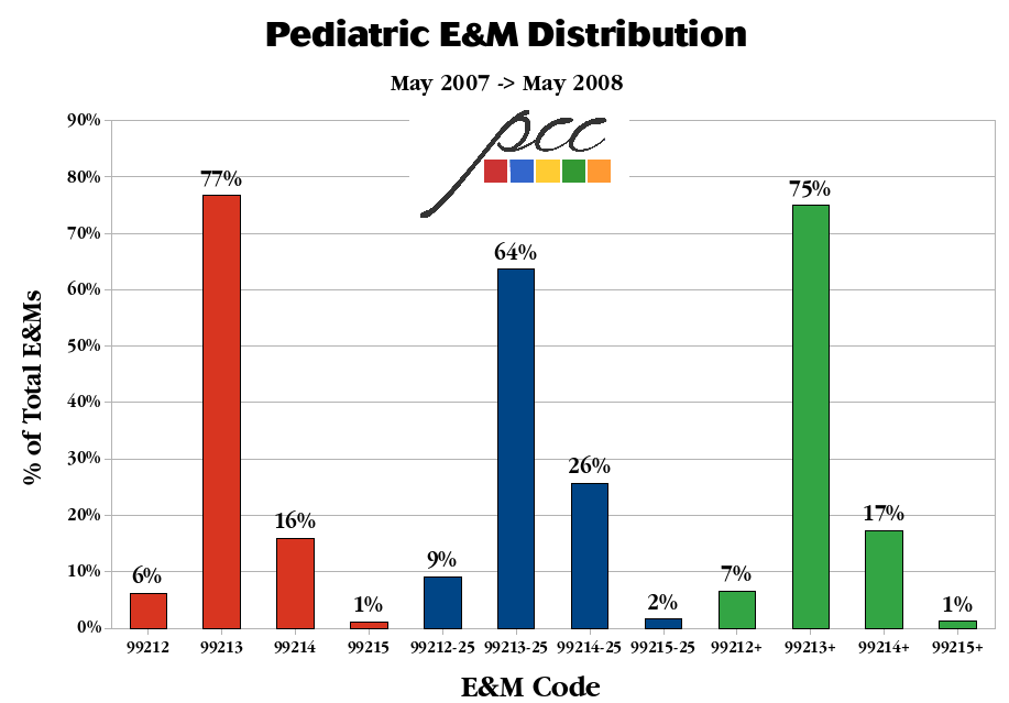
To understand the chart, let me explain a few things. The first set of codes, in red, represents our "vanilla" E&M distribution - plain ol' 99213s, etc. The second set, by label (and in blue), represents the distribution of -25 modified codes which are about 1/6 the size of the vanilla codes now (i.e., enough to have an effect). The final set, in green, represents the combined E&M distribution using all the codes.
Enjoy. Click here or the pic for a better shot.
Comments
0 Comments